Inapinch
Lucky Dipper
Excited to announce the start of a new project/tournament set. Initially, I wanted to build a set to honor my late brother, but after thinking on it a few months, it just didn’t seem right.
Instead, I decided to build a set based on the location where the wifey and I agreed to a lifetime of fun together: barracuda point - a dive site in Malaysia.
For the last few months, I’ve been working on selecting the color setup. I’ve decided on:
T25: lime green (many thanks Berny)
T100: dark blue (many thanks Dan)
T500: fuchsia
T1000: arc (many thanks Darren)

(More quantities are inbound)
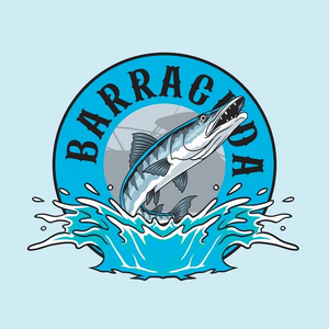
Next step is design. The plan is to hire two Fiverr designers to turn my layout into a design and select the best one for printing with Gear. Please, allow me to introduce never-before-seen artistry, a Rembrandt if you will:

I’m awaiting more chips, and working on the design. Eventually, I’ll mill the chips and have textured labels from Gear later this summer. I’ll share progress along the way.
Instead, I decided to build a set based on the location where the wifey and I agreed to a lifetime of fun together: barracuda point - a dive site in Malaysia.
For the last few months, I’ve been working on selecting the color setup. I’ve decided on:
T25: lime green (many thanks Berny)
T100: dark blue (many thanks Dan)
T500: fuchsia
T1000: arc (many thanks Darren)
(More quantities are inbound)
Next step is design. The plan is to hire two Fiverr designers to turn my layout into a design and select the best one for printing with Gear. Please, allow me to introduce never-before-seen artistry, a Rembrandt if you will:
I’m awaiting more chips, and working on the design. Eventually, I’ll mill the chips and have textured labels from Gear later this summer. I’ll share progress along the way.