The VooDoo Lounge Poker Room

  • Thread starter Thread starter KingZilla
  • Start date Start date
  • Replies Replies: Replies 6
  • Views Views: Views 296

KingZilla

Casino Crown Jewel
Yay or Nay? Light background and Black background versions:
 

Attachments

  • VoodooLounge1.png
    VoodooLounge1.png
    129.5 KB · Views: 39
  • VoodooLoungeBlack.png
    VoodooLoungeBlack.png
    133.9 KB · Views: 38
I would remove "The" and "Poker Room"

Make the "VooDoo Lounge" text a little larger if possible
Thanks, I'm always open to suggestions. I'm just a dabbler. I usually fall on the side of not using "The" in names on a chip design. But sometimes, it sounds better with "The". I think it's a case by case consideration. I tried removing it on this design but it didn't "sound" right (just my opinion). These things are so subjective, that's why I love comments. I also tried VooDoo Lounge and Poker Room, but it's too lengthy. I love designing chip labels. If I can't make one work, I'll move on to another concept. It's time consuming and somewhat frustrating, but oddly, I find it interesting. 🤪
 
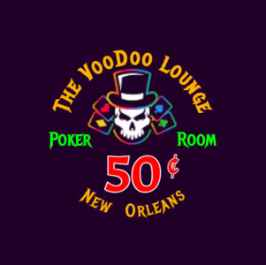
I agree. Sometimes it fits, sometimes it doesn't. I have a few themes on my various chip sets, and two don't use "The" (Tigerhawk Card Room and River Rat), while my NUTS theme does.

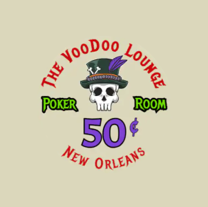
I made my suggestions for your label mainly because the text looked a little small for the theme name, and also "VooDoo" and "Lounge" each have six letters, so if you enlarge that text and split it around the top hat, it might look really nice.
 
I like this idea and prefer the black background
"The Voodoo Lounge" "New Orleans" seems sufficient I'd drop the poker room part personally
And maybe shift the neon green font to the "New Orleans" text or swap the orange font for that and make "the voodoo lounge" the green
 
Back
Top