Design choices in the works

  • Thread starter Thread starter KingZilla
  • Start date Start date
  • Replies Replies: Replies 13
  • Views Views: Views 556

KingZilla

Casino Crown Jewel
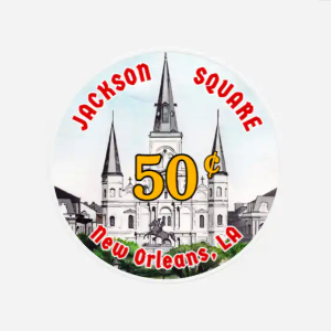
I'm trying to compose a design for a possible new chipset (can you say Cap Dash?). I'm from the New Orleans area and still live in the general area. I'd like something with a local flair. I won't incorporate sports into my design although LSU fandom is like a religion down here. Still a work in progress, but I've got 2 designs so far and welcome any comments/critique.
 

Attachments

  • Newmardigrascasino.png
    Newmardigrascasino.png
    163.7 KB · Views: 52
  • GatorChip.png
    GatorChip.png
    144 KB · Views: 53
Mardi Gras Casino has been done before... a few times. My first set of compression clay chips was BCC Mardi Gras v1,
so I guess I'm partial to that. But Mardi Gras is SO "New Orleans", I had to consider doing it.
 
I would love comments on any preference for Design 1 or Design 2 (or both crap?). What say you?
 
Last edited:
I like both concepts.

I kinda like the 2nd one, but I think that might largely be a function of the black background on the first one.. more contrast might be better. Also, maybe a non-block font?

Have you tried the 1st design on a white background?
 
I like both concepts.

I kinda like the 2nd one, but I think that might largely be a function of the black background on the first one.. more contrast might be better. Also, maybe a non-block font?

Have you tried the 1st design on a white background?
Thanks. Yes, I'm working on trying to isolate the art from the first one to a white background for comparison. Also playing with different fonts as well. These are a work in progress and I appreciate your views. I guess I'm trying to decide which one to go with.
 
My thoughts on Scrown/CapDash is that it’s a classy mold and deserves a classy inlay. Your designs so far are fine I suppose but they’re too cartoony for my taste. Also, an inlay that just straight up saying “Mardi Gras” or “Louisiana” is low hanging fruit. Kind of cheesy IMO. I found this logo online and was just messing with it to give you an idea of the direction that I would go. Clean and simple. Just my thoughts.
IMG_1124.jpeg
 
My thoughts on Scrown/CapDash is that it’s a classy mold and deserves a classy inlay. Your designs so far are fine I suppose but they’re too cartoony for my taste. Also, an inlay that just straight up saying “Mardi Gras” or “Louisiana” is low hanging fruit. Kind of cheesy IMO. I found this logo online and was just messing with it to give you an idea of the direction that I would go. Clean and simple. Just my thoughts.
View attachment 6004
Oooh man, I LIKE this. Yes, I was concerned about the "cartoony" aspect of especially the Alligator design. I even tried to incorporate a design, with modifications, based on the city water meter covers which are regularly stolen (its that popular) but I couldn't make it look good on a 1" label. As far as the two themes, I'm still thinking. Designs are NOT subtle, I agree, but they leave no doubt about the local cultural reference. This is not a "done" project. Thanks for helping me brainstorm some ideas. Your use of the term "cheesy" makes me think of some NAGB chips I've seen. Nothing can beat a couple of those for the "Cheesy-ness" title. :ROFLMAO:
Put a Toilet on the inlay, "Craps & Poker", make it on a Paulson chip and command $5-$8 per chip!

1706622586181.png
 
Last edited:
Another one from Vegas that I was thinking of using although I don't like directly copying designs:
 

Attachments

  • Bstreet2.png
    Bstreet2.png
    104.7 KB · Views: 41
Back
Top